2009/07/28

Blog publishing applications on Mac OS X: part III - ecto

ecto is next on the list (it is spelled with a small 'e'). The Application is priced at 19.95 $ and is available over the net, but then again, which application isn't now a days.

How ecto works
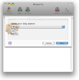
Upon launch you are greeted with a wizard style setup dialogue. You begin with entering where you host your blog and then the account details. So far, so good.
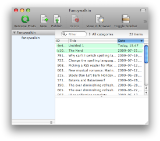
You are then greeted with a view of your blog in the not quite logically named "Viewer" window (if you access it through the menu). On top of the window there is a handy toolbar that allows you to create new, publish and delete posts among other things. The panel on the left contains a list of your blogs and the panel on the right is a typical two-panel selector with posts in the top part and a window for viewing selected post at the bottom.
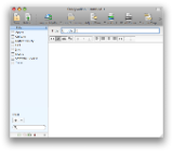
New posts are created by clicking the new button in the tool bar or selecting "new Draft" from the File menu. Editing posts and creating new posts is done in a new window that has the categories to the left, a toolbar with frequently used items on top and a panel for doing the actual blogging to the right. In the panel for blog editing there is a field for labelling the post and another toolbar with formatting options as well as the panel for writing. Once the editing is done the blog can be published with the not quite logically placed "Publish" in the Drafts menu or through the toolbar.

Editing can be done in semi WYSIWYG mode or in HTML mode. The HTML mode is accessible in the editor directly and through the Format menu under the confusingly named "Make HTML Text" option. The mode can be switched back to WYSIWYG by clicking the consistent yet confusingly named "Make Rich Text" in the same menu or directly through the editors toolbar.


My impressions of ecto

My first impression of ecto was that it had a nice clean interface with most features accessible from the tool bars. Writing blog entries was from the outset logical and consistent with my mental model, but then it got less clear.

You work with Drafts in ecto (logical since they haven't been posted yet). But posting is done in the Draft menu. This is logical in one way but different from the other applications I've used. In a way it gives the impression that I am publishing a draft and not a final version. It gets even weirder when I open a published post and I can publish that as a draft. Since many blog systems has a separate options to upload drafts I was unsure what the option was meant to do before I tried it. There is such an option "Save as Draft" but it's located under the file menu and works locally.

There is a import media feature and a insert image feature that probably could have been combined into one. The import media feature works as the media browsers in Apple products, whereas the Insert image feature works by letting you pick an image from your hard drive and set additional options for it such as class, border, size,etc.

Once the image is uploaded you cannot move if. For if you do it won't be uploaded too Flickr where ecto prefers to store it's images. During my writing of this review I tried over and over again to have the images line up the way I wanted them to but ultimately it was a lost cause.

When you publish a post there is an activity viewer that shows the progress but there is no indication in the main "Viewer" window of what is going on. The first time I tried to publish a post I didn't know if the program was publishing so I clicked the "Publish" button again only to get a dialogue about how it was already busy publishing. Bringing out the activity viewer lets you see what's going on but an indicator in the main window would have been helpful.

There is a preview mode that let's you view your posts before publishing but it is hidden in the menus instead of being accessible in the toolbar.

Overall I can't help but feel that ecto can be a great program and it has many clever features such as the insert image dialogue, it's interface for custom html tags, a plugin interface and the built in html checker. It's a shame that it is buggy and inconsistent to the point were just uploading a post becomes too much work.

This post was NOT created in ecto.

2009/07/25

Blog publishing applications on Mac OS X: part II - Blogo

Blogo is a blog publishing application developed by Brain Juice. It's weights in at a hefty 72,6 megabytes but since issues with storage is a thing of the past it's really not a problem. The price is 25$ and the application can be purchased online. I used Blogo version 1.2.8.

How Blogo works

When starting up Blogo you are greeted to a welcome screen where you enter your blog account information. Nice, since it gives you a clear starting point and removes the need to start fumbling with menus on application launch.

Then you are greeted with a quick set of instructions on how to get started with the application.

The interface for posting a new blog post presents you with controls for setting title, date, body and categories of the post. There is some shortcuts for common markup such as bold and italics. There are controls for uploading images and resizing and cropping them. From the outset the default is WYSIWYG mode, however there is an option to edit the post in HTML mode instead. There is no support for more advanced html elements such as tables.

The main window has two tabs one for new blog posts and one for editing blog posts. Editing posts is pretty straight forward. You are greeted with the same interface as when writing new posts plus a drawer to the side of the application where you can select the post you which to edit.

My impressions of Blogo
Generally Blogo is a pleasure to use even though it has some serious flaws. The wizard style setup used to guide the user is welcome. Brain juice has made a conscious decision not to use the standard Mac OS X widgets and have instead opted for a look that sets Blogo apart from the run-of-the-mill applications out there. Some purists might say complain that this is not really adhering to the Apple HIG but I think it is as much about taste and creating a user experience that sets the application apart. In my experience the UI works well even though I find that the custom buttons are to clunky and take up too much screen real estate. All buttons have tool tips but there are no labels for some buttons such as "Preview", "Save as Draft" and "Change Date".

Probably due too the fact that Blogo used custom UI widgets I found it hard to understand when I started using the application. But after a brief running-in period, what I initially found as awkward chunkiness begins to take on a certain charm. Generally speaking the screen flow matches my workflow and except for the strange icon on the button for saving drafts and the button for editing post date, most of the UI controls doesn't require any effort to understand. However, only the window is resizable as a whole and it is not possible to expand the blog post field separately but it's a minor grievance.

Most editors out there that work in html has a WYSIWYG mode as well as a HTML mode. Blogo has a pure html mode that is somewhat senile since it does not keep breaks that you manually insert into the html code when you manually move back and forth between HTML and WYSIWYG mode. Inserting tabs to make your code readable also doesn't work as they are forgotten as well. The WYSIWYG mode is not really a pure WYSIWYG mode since images are shown as placeholders and not actual images which is somewhat confusing from the outset. The are instead managed from two panel below the blog post body, one to control uploading images and one for cropping and resizing.

The preview mode is a nice feature where you can see what the blog post will look like when it's posted. You can set the css so that it matches your blog's.

This post has of course been made with Blogo.

2009/07/24

Blog publishing applications on Mac OS X: part I

Now that I decided to take blogging more seriously I've quickly found the web based interface for posting somewhat limited. This blog is hosted on Blogger which I think is a great free service and it saves me the hassle of setting up WordPress.

What prompted me to start investigating blog publishing applications is the blog composer in Blogger. All is fine as long as you use the WYSIWYG mode but once you want to do anything more demanding and switch to html the problems start to build up. The really big problem is that the dumb html editor interprets line breaks as break tags. That means that any tabs you insert to help you structure your html code will affect the layout. So basically forget doing cool stuff using using css floats and tables. Uploading images is also a hassle since the don't appear where you have your cursor but instead on top of the page. My last complaint is that the WYSIWYG mode frequently freaks out and displays everything in massive letters.

Therefore I have taken it upon myself to review the three main blog publishing applications on Mac OS X: Blogo, MarsEdit and ecto.

Stay tuned!

2009/07/19

Why can't I switch spelling language in Mac OS X directly?

One thing that really has been a thorn in my side for a long time is the way the spell checker works in Mac OS X.

Spelling wise I have no complaints but rather the fact that I have to go through multiple steps in order to change the spelling language is really annoying. I frequently have to change between Dutch, English and Swedish and every time I have to repeat the same process:

- Right click to get the context menu
- Select "Spelling and Grammar".
Who doesn't like hierarchical menus?

- Select "Show Spelling and Grammar".
Dialogue with more menus, hurrah!

- Select the language I want to use in the Spelling and Grammar dialogue.
- Close the window

Way, way to many steps for something that simple.

I have been scouring the internet for a solution for some time but I have found nothing of value yet. I even looked through the API of NSSpellChecker and Status Bars to see if I could write a program for it. A partial victory was realising that I could use Command-Shift-: to get directly to the dialogue but it's a far way from efficient.

The closest I've come to a solution is the article Switching spelling languages on CoCoa Crumbs. However the solution didn't work on my machine and it is not very elegant because it just automates the process, the dialogues still flash by.

I mean what is the point of the Spelling and Grammar dialogue anyway (I only use it to switch language)? Why not have the languages available in the context menu directly?

Or perhaps I should just learn to spell correctly in the first place.

Please Apple just google "switch spelling mac os x" and realise that there are many people out there who would see it as a massive improvement if we were able to change spelling language directly.

2009/07/12

Picking a RSS reader for Mac OS X

I am somewhat ashamed to say that I discovered rss quite late. A little more than a year ago I started using Apple Mail's built in RSS functionality to keep up to date with my favourite sites.

(For you who don't know what RSS is it is basically an xml stream that shows the updates to page, the latest news articles for example. It a really convenient way of keeping a jour with the latest goings on. Atom is basically the same thing from a user's perspective.)

It was quite ok up until now but my list of RSS subscriptions just kept growing the results of the RSS feeds started to get tangled up when seaching for important correspondance and I had to access the context menu in order to open up the links without switching foreground application. So I decided to migrate to a dedicated RSS program. But which one?

So I started looking around for a suitable replacement. I found two articles about RSS on Mac OS X which suggested that I should look at Vienna, NetNewsWire and NewsFire.

Before I start writing about my findings I want to point out that these are three free programs. So independent of which one you choose you are still getting a pretty sweet deal.


So on to the test:

NetNewsWire 3.1.7
NetNewsWire has been around since 2005 and has support for all the features that a RSS devotee would ever need. My first impression was that the user interface was somewhat ugly compared to the other RSS-readers. However as continued to use the product I came to see beyond the exterior and really appreciate the niceties that dwell within. NetNewsWire has support for not only exporting and importing but also preserves groups, feeds can be renamed an rearranged to ones pleasure and when clicking on a folder only the unread items are shown. The interface is a variation of a two-panel selector pattern (like Apple Mail or Outlook) with a list to the left with the feeds. The main window shows the posts of the selected feed/feeds or unread items in a group and the bottom part shows the selected post. When opening links they can either be opened in the default browser or in the program itself. The tab heads are then presented as previews of the page in question (like OmniWeb!).

Pros
+ Rearrangement and renaming of feeds
+ Shows only unread items when clicking on a group (really handy)
+ OmniWeb style previews of the opened web pages
+ Very tailorable (almost every aspect can be changed in the preferences)

Cons
- Somewhat unpolished icons compared to the competitors.

NewNewsWire in action

NewsFire Version 1.5 (74)
I was really impressed with NewsFire when I started to use it. The interface is really sleek and icons and transitions add to that feel. However after a bit of testing it became obvious that the interaction model that NewsFire champions is quite clunky. Unlike the other applications that use variations of the two-panel selector pattern to present information NewsFire uses the menu drilldown pattern (like iPod). That means that when clicking on a post in a feed to read the expanded information you are moved one level deeper and loose overview. To go back to post list the feed has to be clicked again. I can imagine that this is really handy when screen real estate is limited but on a MacBook Pro it is just plain annoying. Apart from the non optimal interaction model there is no support for renaming feeds or rearranging them.

Pros
+ Really sleek icons and transitions

Cons
- Annoying interaction model
- No support for renaming and rearranging feeds.
- Placement of search field is non standard


NewsFire in action


Vienna 2.3.1.2302
Vienna is the only open source application in the lot. It has sleek icons (not as nice as those of NewsFire). It has support for rearranging and renaming feeds and preserves groups when importing and exporting. The interface is a variation of two-panel selector just like NetNewsWire and it works equally well here. I was initially really pleased with this application until I discovered what I perceive as a major flaw: when using the arrow keys to key through the posts of a feed you can't be too fast, otherwise they won't be marked as read. This means that when I go through non interesting posts to get to the one I want to read I have to adjust my speed so that they feeds that I key past get loaded and marked as unread. Annoying to say the least.

Pros
+ Rearrangement and renaming of feeds
+ Very tailorable (almost every aspect can be changed in the preferences)

Cons
- Keying through a list won't mark the items as unread
- Search field is sort of floating in the toolbar just left of where you would expect it

Vienna in action


And the winner is...
NetNewsWire 3.1.7

If it wasn't for the annoying timing issue when using the arrow keys to navigate the posts in Vienna this would have been a much tighter race. NetNewsWire might not look as nice as the other RSS readers but once you see beyond that it's still a winner because of such nice features such as the clever group view and the previews acting as tabs when opening links.

New musical romance: Marina and the Diamonds

I attended London Calling at Paradiso in the beginning of May together with my girlfriend. In preparation for the event I created a Spotify playlist with the acts: London Calling.

London Calling is a yearly event at Paradiso which feature new up and coming British bands. Of the bands that really stood out were: The Airborne toxic event, Little Boots (which cancelled) and Marina and the Diamonds.

Dananananaykroyd playing on the second day

Marina and the Diamonds have since then gone on to be featured in Dagens Nyheter and Svenska Dagbladet and released music videos.

Though I was sort of disappointed with the Little Boots subsequent record release I am now finding myself listening repeatedly to Marina and the Diamonds. It's well worth checking out!


Marina and the Diamonds - I am not a Robot