Finally some recognition :)
2009/12/15
2009/11/06
My Impressions of REALbasic - No refactoring, seriously?
I've started using REALbasic for a project at work for a while now. It's a legacy product and someone somewhere decided to go with REALBasic and when you pick REALBasic you also pick the IDE from REAL Software whether you like it or not.
After using it for a couple of days I can honestly say that it's not as bad as I thought but it's not a pleasant experience.
First off, I must say I applaud the effort of trying to create a development environment that let's you create apps for both Mac OS X, Windows and Linux in a graphical IDE. But there are some serious issues with it that I think people need to know about before getting started.
My biggest grievance is that there is no proper refactoring tool, if you are used to working in Eclipse or Visual Studio it's back to search and replace. This is not a problem for small project but it quickly becomes a big problem when you realise that you forgot to rename the main window and have tons of references to "Window1".
The second biggest problem is that it enforced bad architecture in the same way that Visual Basic does. It's easy to be tempted to duplicate the event handling code under every control.
Third, If you like Basic syntax it's great. Unfortunately I don't. Stuff like using the equal sign for equality and assignment is just error prone.
Forth, you need to buy the professional edition to get access to container controls. Without them creating dynamic user interfaces is really really really tedious and cumbersome. You also need to resort to showing stuff in message boxes for quick debugging. Only in the professional edition do you get access to writing to the console.
Fifth, Why can't I just browse the source code? Why am I restricted to viewing it a piece at a time through clicking on events in the editor?
I'll post more on this as I progress...
2009/11/01
Cudos to Google regarding spell checking
I've found myself using Google Chrome more and more in favour of Safari. And today i discovered what might be it's greatest feature if you like me need to switch between languages a lot.
 This is the standard Apple Spell checker. Everything is hidden in dialogues and menus. I might as well be using Microsoft Office.
 Behold the awesomeness of Google Chrome. It is not a super advanced innovation they just effectively reduced the number of clicks by half and increased visibility while doing so. It's so great that I don't even care that it's not properly localised. Go Google go!
Again with the Mac OS X spell checker...
As an expat in the Netherlands you constantly have to battle with getting the definite articles "het" (neuter) and "de" (masculine, feminine and plural) right. They are easily the Scylla and Charybdis of the Dutch language and just like our definite articles in Swedish ("den" and "det") there is no good rule to help you know when to use which.
During my Dutch course at Vrije Universiteit I got thought the rule that if in doubt use "de" since it is the most frequently used of the two.
I recently wrote a presentation in Dutch and I really wanted to get the Dutch text on the slides correct. I thought that selecting the user "Check Grammar" in the Mac OS X Spell checker would help me but unfortunately is seemed to do very little.
 So I did a little test to see if the check box had any effect on the following sentences:
Dutch
De paard loopt snel. (wrong)
Het paard loopt snel. (correct)
English
The horse fast runs. (wrong)
The horse runs fast. (correct)
Swedish
Hästen fort springer. (wrong)
Hästen springer fort. (correct)
According to the spell checker all of the above sentences are correct. I have no clue what is meant by "Check Grammar" according to Apple but it certainly does not involve word order or articles. Thanks be to the almighty for online dictionaries and Wordfinder.
And shame on the UI team at apple who put the checkbox there without checking if the programmers actually had implemented the underlying functionality.
... of course Microsoft Word would be the other extreme warning about old fashioned sentence constructions left and right as soon as there is a deviation from the subject verb object word order.
2009/10/21
Tomcat Manager for Mac OS X 0.9 released
Download and enjoy, it is bundled and works like a standard Mac OS X app. The UI is not so nice right now but we have major changes planned. The core functionality is working fine however. We have also considered porting it to various Linux flavours just for fun (would require little change).
2009/10/20
Tomcat Manager for Mac OS X released to the public
![]() Tomat Manager for Mac OS X is a minimalistic application for starting and stopping Tomcat on (you guessed it) Mac OS X I started developing it internally at Knowledge Values for business people who needed to use Tomcat for demoing purposes. Instead of typing obscure commands in the terminal the application would allow them to start and stop the server with the click of a button. Knowledge Values was nice enough to release the source on Source Forge. My colleague Leonard van Driel has joined me and we intend to continue developing the application but hopefully we will get some help from the nice people in the open source community.
Tomat Manager for Mac OS X is a minimalistic application for starting and stopping Tomcat on (you guessed it) Mac OS X I started developing it internally at Knowledge Values for business people who needed to use Tomcat for demoing purposes. Instead of typing obscure commands in the terminal the application would allow them to start and stop the server with the click of a button. Knowledge Values was nice enough to release the source on Source Forge. My colleague Leonard van Driel has joined me and we intend to continue developing the application but hopefully we will get some help from the nice people in the open source community.
https://sourceforge.net/projects/tomcatmanager/
I'll post a runnable version of the application shortly which doesn't require subversion and Eclipse. The shebang is released under GPL 3.0.
Back from Design by Fire 2009
 Just got back from Design by Fire 2009 in Utrecht. It was great fun. The two definitive highlights were Robert Hoekman Jr's talk on Interaction Design Framework and James Box and Cennydd Bowles from Clearleft talk on The Music of Interaction Design.
 Robert Hoekman Jr. talked about how how Usability testing doesn't provide reliable results when done with small samples and that Design Patterns only solve micro-problems. His solution is instead focussing on bigger sets of design problems by grouping Design Patterns into bigger proven Interaction Frameworks, e.g. the pagination pattern might be part of the Catalogue Framework. It was quite thought provoking and a good incentive to by his and Jared Spool's book Web anatomy. He backed up his thoughts through the results of Rolf Molich's Comparative Usability Testing
 James Box and Cennydd Bowles talked about using music as a metaphor for interaction design and user experience. Music shares many aspects with UX such as it's asynchronous nature and it's social codification. It think the talk was more of an experience than something to be retold. Hopefully someone filmed it.
2009/10/18
10/GUI Multi-touch user interface
Redefining the way we interact with computers is a pretty ambitious task as far as things go, but that's just what R. Clayton Miller is looking to do with his so-called 10/GUI project, and he may just be onto something. Miller begins with the notion that the traditional mouse-based interface lacks the "interaction bandwidth" afforded by multitouch interfaces, and that touch-enabled desktops (or laptops) are inherently problematic since they can't be used for prolonged periods of time -- even a flat surface will do a number on your neck if you use it all day. To solve that problem, Miller proposes separating the touch surface from the display and placing it below the keyboard in the form of a large, hybrid capacative / resistive touch panel. That's just the beginning, however, and Miller has also devised a whole new interface that makes use of all your fingers, and a new linear means of displaying windows that strikes a balance ease of use and the ability to manage numerous applications. Of course, there are some drawbacks -- you'd still likely pull out a mouse for Photoshop or a marathon Left 4 Dead session -- but we'd certainly be curious to see how this would play out in practice. Head on past the break for a full video overview.
[Via Slashdot]Continue reading 10/GUI interface looks to redefine the touch-enabled desktop
Filed under: Desktops, Software
10/GUI interface looks to redefine the touch-enabled desktop originally appeared on Engadget on Thu, 15 Oct 2009 14:58:00 EST. Please see our terms for use of feeds.
Read | Permalink | Email this | Comments
via Engadget
2009/10/17
My girlfriend has an Android, I have an old SE
 My girlfriend picked up her new HTC Magic yesterday. It's not activated yet so she hasn't really touched it. I, on the other hand, have been playing with it ever since. It is by no means an iPhone when it comes to UX but on the other hand it doesn't tie you down with a 2 year plan. There are many minor things that bogs down the UX, the weird effect when the phone is turned from being held horizontally to vertically and vice versa for instance. On the iPhone there is a nice graphical effect but on the HTC Magic the image is blurred for a second and the phone freezes then it shows the screen in the new mode.
I do feel that the iPhone is restrictive in the sense that I can only get my apps from the Apple App Store and that applications needs to be approved by Apple's seemingly random committee before release there. The Android suffers from none of those things, however (which was discussed at the last IxDA Café) the vast majority of people probably don't care (those remaining 80% which we are actually designing for according to HFI).
I did write a little application for it just to try it out. Sadly the development environment does suffer from the same problem that most Java based development systems suffer from - the lack of a proper graphical development environment for creating the UI. You can specify the UI an XML but that is not what I would call usable. There is a program that is called DroidDraw but it is by no means Interface Builder. The default environment for developing applications is Eclipse and there is nothing wrong with Eclipse for writing code but I switch to NetBeans whenever I have to design a user interface for a Java application.
Another problem is that that for being a touchscreen device it has way to many buttons. The way that Apple solved it with gestures is simply a lot more pleasurable to use. In a way it makes me think of the third generation iPods with the row of buttons on top of the scroll wheel. Simply put, there was a reason that apple placed the buttons inside the wheel in the following iteration. However Apple is in an unique position since they have control over both hardware and software.
Now that I ranted on about the things that I didn't like I must admit that my experience was positive overall especially considering the pricetag. I am actually contemplating buying one myself since I do not think my company has any plans of upgrading me from my old SE K850 to something modern.
2009/10/15
UX Cocktail Hours Amsterdam
UX Cocktail Hours Amsterdam:
"This is a group for User Experience practitioners(**) in and around Amsterdam who would like to attend (one or more) UX Cocktail Hours in the neighborhood. The goal of the cocktail hours is to get together informally, share news and ideas through short presentations, meet other UX practitioners, chat about work, the weather, "koetjes en kalfjes" (chit-chat), and have a drink (or two). Most Cocktail Hours these days are held at the offices of a local UX department and the drinks and some snacks are usually sponsored."
I missed the last one but this evening a managed to secure a seat. It is going to be an interesteing evening filled with UX/UI an possibly beers at Fabrique. Visit the Yahoo group
2009/10/03
New Musical Romance: Peter Fox
German Music at it's best! I first came across this when I went back to Berlin i February for a short weekend. How wouldn't stop three Swedish men in a small car driving from Amsterdam to Berlin for a one day visit? Back then "Schwartz zu Blau" played non stop on the telly.
Retro Gaming Museum
French Government Lobbied To Establish Retro Gaming Museum:Now there's an idea we can all agree with!
via Nintendo Life | Latest News
2009/09/23
Callo Callay! Unsung Snow Leopard feature: multiple-language spell checker
Finally, Spell checking problems for multi-linguals is a thing of the past! To bad we haven't upgraded at work yet.
Unsung Snow Leopard feature: multiple-language spell checker
Shared via AddThis
2009/08/27
Going Design by Fire 2009
My company is sending me to Design by Fire 2009 on 20th of October in Utrecht. Since I thoroughly enjoyed the Chi Nederland conference earlier this year I can only assume it's going to be a blast!

2009/08/26
Why users aren't designers
I am reading Bill Buxton's Sketching User Experiences. The chapter "The Question of Design" begins with a polemic on viewing users as designers and Norman's statement "We are all designers". A good comparison that Bill uses to illustrate the absurdity of the argument is the notion that we all would be mathematicians because we (hopefully) can add up the prices of a bill.
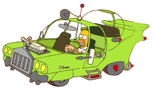
I would advise anyone who believes that participatory design should be equal to letting the users design to ponder what happens when Homer Simpson get to be a designer for his brother's car company due to the same logic.
2009/08/22
Blog publishing roundup
After reviewing Blogo, ecto and MarsEdit I can whole heartedly say that you will get most bang for the buck from Blogo.
Blogo does all the things that the other applications does plus more and has hard to beat features such as:
- No Flickr dependence.
- Ability to resize and crop images from within the program.
- By not keeping breaks in the html code it avoids weird layouts on Blogger.
- Clean interface where most of the action is confined in the main window.
So even though I think that the buttons are somewhat clunky it is head and shoulders above the competition. If you are using a Mac and are into blogging then Blogo is the way to go.
Blog publishing applications on Mac OS X: part IV - MarsEdit
![]() MarsEdit from Red Sweater Software is the last application I'll review in my series on blog publishing applications on Mac OS X. It has a cool icon with a rocketship and the planet Mars and is priced at 29.95 $. The version used in this test is 2.3.2.
MarsEdit from Red Sweater Software is the last application I'll review in my series on blog publishing applications on Mac OS X. It has a cool icon with a rocketship and the planet Mars and is priced at 29.95 $. The version used in this test is 2.3.2.
How MarsEdit works
 When MarsEdit is launched for the first time you are greeted to a wizard pattern dialogue that takes you through the process of setting up a blog. You can either create a new blog or supply information about an existing blog. After passwords and the title of the blog have been set you are all set to start blogging.
 The main view in MarsEdit is a three panel selector which lists your blogs on the left, your posts in the top left panel and the selected blog post in the bottom right panel. Common controls such as "New Post", "Delete Post", "Edit Post" and "Media" are conveniently placed in the toolbar on top.
 Creating blog posts can only be done in html but there is a preview mode to help you on the way. The toolbar on top has links to html tags in case you forget or just don't fancy typing. On the side is a panel with the categories and at it's bottom you can add new ones.
 Images are added through a the Media Manager. MarsEdit stores your pictures on Flickr so you'll need an account there as well. There is a serious limitation in that images cannot be resized from within the program. Instead that has to be done either in the html img tag or in an other program.
 Editing html can be a bore and in case you aren't happy with the html tags that come predefined you can always add new ones through the Markup Macros dialogue
My impressions of MarsEdit
MarsEdit is a competent program with some serious drawbacks. I like the clear and logical layout and naming and the stylish icons. It supports pinging sites when you update your blog and the preview mode in combination with the html editing works very well for me. However not everyone has knowledge of html and this will be a big drawback for many people. I would have preferred to have the option to edit in wysiwyg mode as well.
The fact that media can only be added using Flickr is another drawback but not as big as the fact that there is no built in support for resizing images.
Blogger's built in semi wysiwyg html interpreter considers breaks in the html codes the same as actual break tags and I would love to have an option to strip out the breaks before publishing. This is not a problem with MarsEdit however but something that the whizkids at Blogger came up with.
I would not discourage anyone with experience in coding web pages from buying MarsEdit. Just make sure that you know your html before you open your wallet.
2009/08/19
New musical romance: Caparezza
My sister joined during the vacation in Hälsingland. She has been a semester in Bologna studying and insisted I would listen to Caparezza. Apparently he is the latest and greatest in Italian music and I have to agree. I have decided to make his song iodellavitanonhocapitouncazzo my new theme song (much like in that Family Guy episode)
Check out Vieni A Ballare In Puglia :
2009/08/18
Härliga Hälsingland
Back from two weeks of forest work, roof laying and paddling canoe and kayak at my parent's place in Hälsingland. I put Anna and my sisters to work gathering wood for the winter.
 Repairing the barn
 Anna dragging newly cut logs
 Maria playing with Mogwai
 Me kayaking
2009/07/28
Blog publishing applications on Mac OS X: part III - ecto
![]() ecto is next on the list (it is spelled with a small 'e'). The Application is priced at 19.95 $ and is available over the net, but then again, which application isn't now a days.
ecto is next on the list (it is spelled with a small 'e'). The Application is priced at 19.95 $ and is available over the net, but then again, which application isn't now a days.
How ecto works
 Upon launch you are greeted with a wizard style setup dialogue. You begin with entering where you host your blog and then the account details. So far, so good.
 You are then greeted with a view of your blog in the not quite logically named "Viewer" window (if you access it through the menu). On top of the window there is a handy toolbar that allows you to create new, publish and delete posts among other things. The panel on the left contains a list of your blogs and the panel on the right is a typical two-panel selector with posts in the top part and a window for viewing selected post at the bottom.
 New posts are created by clicking the new button in the tool bar or selecting "new Draft" from the File menu. Editing posts and creating new posts is done in a new window that has the categories to the left, a toolbar with frequently used items on top and a panel for doing the actual blogging to the right. In the panel for blog editing there is a field for labelling the post and another toolbar with formatting options as well as the panel for writing. Once the editing is done the blog can be published with the not quite logically placed "Publish" in the Drafts menu or through the toolbar.
Editing can be done in semi WYSIWYG mode or in HTML mode. The HTML mode is accessible in the editor directly and through the Format menu under the confusingly named "Make HTML Text" option. The mode can be switched back to WYSIWYG by clicking the consistent yet confusingly named "Make Rich Text" in the same menu or directly through the editors toolbar.
My impressions of ecto
My first impression of ecto was that it had a nice clean interface with most features accessible from the tool bars. Writing blog entries was from the outset logical and consistent with my mental model, but then it got less clear.
You work with Drafts in ecto (logical since they haven't been posted yet). But posting is done in the Draft menu. This is logical in one way but different from the other applications I've used. In a way it gives the impression that I am publishing a draft and not a final version. It gets even weirder when I open a published post and I can publish that as a draft. Since many blog systems has a separate options to upload drafts I was unsure what the option was meant to do before I tried it. There is such an option "Save as Draft" but it's located under the file menu and works locally.
There is a import media feature and a insert image feature that probably could have been combined into one. The import media feature works as the media browsers in Apple products, whereas the Insert image feature works by letting you pick an image from your hard drive and set additional options for it such as class, border, size,etc.
Once the image is uploaded you cannot move if. For if you do it won't be uploaded too Flickr where ecto prefers to store it's images. During my writing of this review I tried over and over again to have the images line up the way I wanted them to but ultimately it was a lost cause.
When you publish a post there is an activity viewer that shows the progress but there is no indication in the main "Viewer" window of what is going on. The first time I tried to publish a post I didn't know if the program was publishing so I clicked the "Publish" button again only to get a dialogue about how it was already busy publishing. Bringing out the activity viewer lets you see what's going on but an indicator in the main window would have been helpful.
There is a preview mode that let's you view your posts before publishing but it is hidden in the menus instead of being accessible in the toolbar.
Overall I can't help but feel that ecto can be a great program and it has many clever features such as the insert image dialogue, it's interface for custom html tags, a plugin interface and the built in html checker. It's a shame that it is buggy and inconsistent to the point were just uploading a post becomes too much work.
This post was NOT created in ecto.
2009/07/25
Blog publishing applications on Mac OS X: part II - Blogo
![]() Blogo is a blog publishing application developed by Brain Juice. It's weights in at a hefty 72,6 megabytes but since issues with storage is a thing of the past it's really not a problem. The price is 25$ and the application can be purchased online. I used Blogo version 1.2.8.
Blogo is a blog publishing application developed by Brain Juice. It's weights in at a hefty 72,6 megabytes but since issues with storage is a thing of the past it's really not a problem. The price is 25$ and the application can be purchased online. I used Blogo version 1.2.8.
How Blogo works
 When starting up Blogo you are greeted to a welcome screen where you enter your blog account information. Nice, since it gives you a clear starting point and removes the need to start fumbling with menus on application launch.
 Then you are greeted with a quick set of instructions on how to get started with the application.
 The interface for posting a new blog post presents you with controls for setting title, date, body and categories of the post. There is some shortcuts for common markup such as bold and italics. There are controls for uploading images and resizing and cropping them. From the outset the default is WYSIWYG mode, however there is an option to edit the post in HTML mode instead. There is no support for more advanced html elements such as tables.
 The main window has two tabs one for new blog posts and one for editing blog posts. Editing posts is pretty straight forward. You are greeted with the same interface as when writing new posts plus a drawer to the side of the application where you can select the post you which to edit.
My impressions of Blogo
Generally Blogo is a pleasure to use even though it has some serious flaws. The wizard style setup used to guide the user is welcome. Brain juice has made a conscious decision not to use the standard Mac OS X widgets and have instead opted for a look that sets Blogo apart from the run-of-the-mill applications out there. Some purists might say complain that this is not really adhering to the Apple HIG but I think it is as much about taste and creating a user experience that sets the application apart. In my experience the UI works well even though I find that the custom buttons are to clunky and take up too much screen real estate. All buttons have tool tips but there are no labels for some buttons such as "Preview", "Save as Draft" and "Change Date".
Probably due too the fact that Blogo used custom UI widgets I found it hard to understand when I started using the application. But after a brief running-in period, what I initially found as awkward chunkiness begins to take on a certain charm. Generally speaking the screen flow matches my workflow and except for the strange icon on the button for saving drafts and the button for editing post date, most of the UI controls doesn't require any effort to understand. However, only the window is resizable as a whole and it is not possible to expand the blog post field separately but it's a minor grievance.
Most editors out there that work in html has a WYSIWYG mode as well as a HTML mode. Blogo has a pure html mode that is somewhat senile since it does not keep breaks that you manually insert into the html code when you manually move back and forth between HTML and WYSIWYG mode. Inserting tabs to make your code readable also doesn't work as they are forgotten as well. The WYSIWYG mode is not really a pure WYSIWYG mode since images are shown as placeholders and not actual images which is somewhat confusing from the outset. The are instead managed from two panel below the blog post body, one to control uploading images and one for cropping and resizing.
The preview mode is a nice feature where you can see what the blog post will look like when it's posted. You can set the css so that it matches your blog's.
This post has of course been made with Blogo.
2009/07/24
Blog publishing applications on Mac OS X: part I
Now that I decided to take blogging more seriously I've quickly found the web based interface for posting somewhat limited. This blog is hosted on Blogger which I think is a great free service and it saves me the hassle of setting up WordPress.
What prompted me to start investigating blog publishing applications is the blog composer in Blogger. All is fine as long as you use the WYSIWYG mode but once you want to do anything more demanding and switch to html the problems start to build up. The really big problem is that the dumb html editor interprets line breaks as break tags. That means that any tabs you insert to help you structure your html code will affect the layout. So basically forget doing cool stuff using using css floats and tables. Uploading images is also a hassle since the don't appear where you have your cursor but instead on top of the page. My last complaint is that the WYSIWYG mode frequently freaks out and displays everything in massive letters.
Therefore I have taken it upon myself to review the three main blog publishing applications on Mac OS X: Blogo, MarsEdit and ecto.
Stay tuned!
2009/07/19
Why can't I switch spelling language in Mac OS X directly?
One thing that really has been a thorn in my side for a long time is the way the spell checker works in Mac OS X.


Spelling wise I have no complaints but rather the fact that I have to go through multiple steps in order to change the spelling language is really annoying. I frequently have to change between Dutch, English and Swedish and every time I have to repeat the same process:
- Right click to get the context menu
- Select "Spelling and Grammar".

Who doesn't like hierarchical menus?
- Select "Show Spelling and Grammar".

Dialogue with more menus, hurrah!
- Select the language I want to use in the Spelling and Grammar dialogue.
- Close the window
Way, way to many steps for something that simple.
I have been scouring the internet for a solution for some time but I have found nothing of value yet. I even looked through the API of NSSpellChecker and Status Bars to see if I could write a program for it. A partial victory was realising that I could use Command-Shift-: to get directly to the dialogue but it's a far way from efficient.
The closest I've come to a solution is the article Switching spelling languages on CoCoa Crumbs. However the solution didn't work on my machine and it is not very elegant because it just automates the process, the dialogues still flash by.
I mean what is the point of the Spelling and Grammar dialogue anyway (I only use it to switch language)? Why not have the languages available in the context menu directly?
Or perhaps I should just learn to spell correctly in the first place.
Please Apple just google "switch spelling mac os x" and realise that there are many people out there who would see it as a massive improvement if we were able to change spelling language directly.
2009/07/12
Picking a RSS reader for Mac OS X
I am somewhat ashamed to say that I discovered rss quite late. A little more than a year ago I started using Apple Mail's built in RSS functionality to keep up to date with my favourite sites.
 NetNewsWire 3.1.7

 NewsFire Version 1.5 (74)

 Vienna 2.3.1.2302

NetNewsWire 3.1.7
(For you who don't know what RSS is it is basically an xml stream that shows the updates to page, the latest news articles for example. It a really convenient way of keeping a jour with the latest goings on. Atom is basically the same thing from a user's perspective.)
It was quite ok up until now but my list of RSS subscriptions just kept growing the results of the RSS feeds started to get tangled up when seaching for important correspondance and I had to access the context menu in order to open up the links without switching foreground application. So I decided to migrate to a dedicated RSS program. But which one?
So I started looking around for a suitable replacement. I found two articles about RSS on Mac OS X which suggested that I should look at Vienna, NetNewsWire and NewsFire.
Before I start writing about my findings I want to point out that these are three free programs. So independent of which one you choose you are still getting a pretty sweet deal.
So on to the test:
 NetNewsWire 3.1.7
NetNewsWire has been around since 2005 and has support for all the features that a RSS devotee would ever need. My first impression was that the user interface was somewhat ugly compared to the other RSS-readers. However as continued to use the product I came to see beyond the exterior and really appreciate the niceties that dwell within. NetNewsWire has support for not only exporting and importing but also preserves groups, feeds can be renamed an rearranged to ones pleasure and when clicking on a folder only the unread items are shown. The interface is a variation of a two-panel selector pattern (like Apple Mail or Outlook) with a list to the left with the feeds. The main window shows the posts of the selected feed/feeds or unread items in a group and the bottom part shows the selected post. When opening links they can either be opened in the default browser or in the program itself. The tab heads are then presented as previews of the page in question (like OmniWeb!).
Pros
+ Rearrangement and renaming of feeds
+ Shows only unread items when clicking on a group (really handy)
+ OmniWeb style previews of the opened web pages
+ Very tailorable (almost every aspect can be changed in the preferences)
Cons
- Somewhat unpolished icons compared to the competitors.

NewNewsWire in action
 NewsFire Version 1.5 (74)
I was really impressed with NewsFire when I started to use it. The interface is really sleek and icons and transitions add to that feel. However after a bit of testing it became obvious that the interaction model that NewsFire champions is quite clunky. Unlike the other applications that use variations of the two-panel selector pattern to present information NewsFire uses the menu drilldown pattern (like iPod). That means that when clicking on a post in a feed to read the expanded information you are moved one level deeper and loose overview. To go back to post list the feed has to be clicked again. I can imagine that this is really handy when screen real estate is limited but on a MacBook Pro it is just plain annoying. Apart from the non optimal interaction model there is no support for renaming feeds or rearranging them.
Pros
+ Really sleek icons and transitions
Cons
- Annoying interaction model
- No support for renaming and rearranging feeds.
- Placement of search field is non standard
 Vienna 2.3.1.2302
Vienna is the only open source application in the lot. It has sleek icons (not as nice as those of NewsFire). It has support for rearranging and renaming feeds and preserves groups when importing and exporting. The interface is a variation of two-panel selector just like NetNewsWire and it works equally well here. I was initially really pleased with this application until I discovered what I perceive as a major flaw: when using the arrow keys to key through the posts of a feed you can't be too fast, otherwise they won't be marked as read. This means that when I go through non interesting posts to get to the one I want to read I have to adjust my speed so that they feeds that I key past get loaded and marked as unread. Annoying to say the least.
Pros
+ Rearrangement and renaming of feeds
+ Very tailorable (almost every aspect can be changed in the preferences)
Cons
- Keying through a list won't mark the items as unread
- Search field is sort of floating in the toolbar just left of where you would expect it
And the winner is...
NetNewsWire 3.1.7If it wasn't for the annoying timing issue when using the arrow keys to navigate the posts in Vienna this would have been a much tighter race. NetNewsWire might not look as nice as the other RSS readers but once you see beyond that it's still a winner because of such nice features such as the clever group view and the previews acting as tabs when opening links.
New musical romance: Marina and the Diamonds
I attended London Calling at Paradiso in the beginning of May together with my girlfriend. In preparation for the event I created a Spotify playlist with the acts: London Calling.
London Calling is a yearly event at Paradiso which feature new up and coming British bands. Of the bands that really stood out were: The Airborne toxic event, Little Boots (which cancelled) and Marina and the Diamonds.

Marina and the Diamonds have since then gone on to be featured in Dagens Nyheter and Svenska Dagbladet and released music videos.
Though I was sort of disappointed with the Little Boots subsequent record release I am now finding myself listening repeatedly to Marina and the Diamonds. It's well worth checking out!
London Calling is a yearly event at Paradiso which feature new up and coming British bands. Of the bands that really stood out were: The Airborne toxic event, Little Boots (which cancelled) and Marina and the Diamonds.

Dananananaykroyd playing on the second day
Marina and the Diamonds have since then gone on to be featured in Dagens Nyheter and Svenska Dagbladet and released music videos.
Though I was sort of disappointed with the Little Boots subsequent record release I am now finding myself listening repeatedly to Marina and the Diamonds. It's well worth checking out!
Marina and the Diamonds - I am not a Robot
2009/06/28
Steely Dan Left Bank Holiday tour and "Heinken Music Hall fun bills"
Me and my dad went to see Steely Dan in Heineken Music Hall. The concert was good especially after a couple of caipirinhas.

Steely Dan playing
On a sour note there is a quite strange monetary system that you need to adhere to when buying stuff in Heineken Music Hall. Normal Euros don't work instead you need to exchange them for Heinken Music Hall coins. These coins are non-refundable and since you I didn't want to be running back and forth to the exchange booth I turned 40 € into 30 Heinken Music Hall "fun bills".
Batavia and Bataviawerf

This weekend my dad came to visit and we went to Bataviawerf outside Lelystad in Flevoland to look at the boat Batavia; or rather a reconstruction since the original grounded near Western Australia.
I've read Batavia's Graveyard by Mike Dash about a year ago and really liked it and since then I wanted to go see the replica. So now I have one more Dutch cultural site that I can tick of my todo list.
It's pretty cool to see a big sailing ship especially one that has been the centre for a bloody mutiny. It's probably not as big as the ship Vasa but it was well worth the trip. Especially since it is pretty cool to travel across fake land imagining that you are five meters under water.
The ever diminishing refresh/reload button in browsers, part II
After searching various forums I came across a plausible answer:
Most people don't use the refresh button. They might visit the site once and later go back at a later point. Since I am doing development and prototyping work I frequently reload the site many times to check the changes. I thought that users would use the refresh the site if it got stalled during load. That is probably to advanced for many of them.
However I stand by my first blog entry, what harm could that button possibly have done when it was big and accessible. Why hide it?
But bottom line, know your users and you are not a user.
2009/06/22
The ever diminishing refresh/reload button in browsers
I was ticked off that the resize button in Internet Explorer 7 had gotten so small that a lot of precision is needed to click on it. Instead of the full size toolbar button in IE 6 there is a tiny little button that not only was smaller but also further away from the rest of the navigation buttons. So instead of moving the mouse to the top left corner of the screen and being able to move back and forth and resize there was now a need to move the mouse to the other size of the address field.
Since I use Mac OS X for my daily work and only use Windows for testing I shrugged and got on. But now Apple has made the same design flaw in Safari 4.
Is it just me who finds it annoying and what ever happened to Fitts's law?
I am well aware that there are keyboard combinations available but I wonder what user testing and thinking might lay behind this change. Funnily instead of Microsoft borrowing good ideas from Apple, Apple is suddenly borrowing bad ideas from Microsoft. Luckily, Firefox has kept it's refresh/reload button same size and accessible.
2009/06/17
UI specification template
Looking around for some information about standardised UI/Interaction design templates I came across this interesting discussion on IxDa:
Öresundstågen, never ever ever on time
I am really fed up with Öresundstågen.
The company Öresundståg is a joint venture between Danish Trafikstyrelsen and several smaller regional public transport authorities including Skånetrafiken, which runs the trains in the province of Skåne (the southmost part of Sweden).
I frequently travel back and forth between Schiphol and Sweden. The quickest route (very questionable) is to take the flight to Copenhagen Airport Kastrup and take the train across the bridge.

From the horse's mouth: First train cancelled, second train 27 minutes late,
third train cancelled and forth train 12 minutes late
The train ride should come to 30-40 minutes but there is a problem. There is always delays. I am not kidding, since I moved to Holland there has perhaps been two occasions when the train has departed from Kastrup on time. Öresundståg has the courtesy to announce why they are delayed so by now I have heard them all: "The conductor didn't show up", "We have engine failure", "There is a problem with the wiring" and "Bla bla bla bla bling bling bla".


So after god knows how many delayed trips I wrote a letter to Öresundståg with a business proposal:
Händelsedatum: 2009-05-29
Händelsetid: 20:00
Åkte med: Tåg
Plats: Kastrup
Hej, jag reser med Öresundståget frekvent till och från Kastrup. De senaste 10 gånger har tåget varit föresenat. Nu senast med nästan 40 minuter.
Jag undrar varför ni bemödar er med att ge ut en tidtabell eftersom den inte verkar ha någon som helst inverkan på de egentliga avgångstiderna?
Jag har därför ett besparingsförslag. Jag kan ge ut en tidtabell med en rad randomiserade avgångstider (jag är grafiker och programmerare). Då behöver ni endast betala min lön och kan avskeda all personal som är involverad i ert planeringsarbete. Tågen kan ni fortsätta skicka ut som ni gör nu (tillsynes slumpvis).
Om ni inte godtar mitt förslag vill jag ha en förklaring till varför ni inte klarar av att följa er tidtabell. Utifrån den hätska stämning som uppstår på era tåg när ni är försenade kan det skönjas att fler än jag skulle vilja få en förklaring. Varför inte publicera det på er hemsida och i er tidning ombord på tåget?
Jag bifogar gladeligen en lista med mina flygturer och era förseningar om så önskas.
Translation:
Hello, I travel frequently to and from Kastrup. On the last ten occasions there has been delays. Last time there was a delay of 40 minutes.
I am wondering why you as a company bother with printing schedules since it doesn't seem to have any influence what so ever on the actual arrival and departure times.
Therefore I have a business proposal that I which you would consider. I can make a schedule for you with randomised departure times (I am graphical designer and programmer). You would then only have to pay my salary and can fire all personnel involved with the planning. The trains can continue arriving and departing apparently randomised.
If you do not accept my proposal I would like to have an explanation as to why you are not able to follow the schedule. From the atmosphere among my fellow passengers it is quite obvious that there are more people then me who would like to have an explanation. Why not publish it on you web site or the magazine on board.
I can gladly send you a list of my flights and the delays.
On the sixteenth of June I got the following reply:
Hej,
Tackar så mycket för ditt förslag, men det måste vi tyvärr avböja.
När det gäller trafiken, jobbar vi hela tiden på att bli bättre. Dock är det många aktörer som skall samsas om resuserna, och när något går fel får det ofta följder för alla aktörer. Detta kan vi bara beklaga.
Med vänlig hälsning
Translation:
Hello, thank you very much for your proposal but we have to decline.
We are constantly working on improving our service. There are many actors involved that have to share the resources and when something goes wrong it impacts all parties involved. We are sorry for the inconvenience.
Best Regards
So I guess they didn't see the huge amounts of saving my proposal would deliver. Their loss I suppose.
2009/06/13
CHI Nederland 2009: Change!
I was sponsored by my work to attend CHI Nederland 2009: Change!.
It was great fun. Check out the photostream (not courtesy of me).
I think that the most valuable lesson that I got from the conference was that multichannel business solutions not only requires the information to be consistent across all channels but also the user experience (Geke van Dijk, STBY). It's quite obvious but has some real design implications that are not solved during a coffee break.


Me and a fellow HCI enthousiast during lunch
Here are some pictures that I took (not very good quality):

Hiroshi Ishiguro,
Professor at Intelligent Robotics Laboratory, Osaka, Japan

Globe 4D - Who needs a regular globe when they have one of these?

Gilbert Cockton,
Research Chair in Human-Computer Interaction (HCI), University of Sunderland
2009/05/27
Edinburgh, Fish and Chips, Cabs, Travellodge and a civil partnership ceremony.
Anna and I attended a civil partnership ceremony for two of Annas friends. The trip was great fun (I had fish and chips) besides standing in line for an hour to get a cab at the airport and I wouldn't for the life of me recommend anyone to stay at the Travellodge.
When it came to standing in line for a cab I was still kind of glad that we were in UK and not in Holland. I can just imagine the Dutch all running over one another to get ahead in the queue.
The afterparty was in a bar that served drinks in tea cups, inventive!


Anna visiting Edinburgh castle (I was there too)
2009/04/28
New York!
Anna and I went to the Big Apple for five days. Normally when I go back from holiday I feel that I am sort of done and that I've seen what I wanted to see. This time however I felt that I could stay months and still only scratch the surface.

Anna on Brooklyn Bridge
Subscribe to:
Posts (Atom)