2010/05/24

It's a great time to be a retrogamer

Oh, what times we live in. There difference between in graphical splendour between the current console generation and the 8–  and 16–bit era is simply enormous. Just compare the pixelated Nintedo 8-bit games of days of yore to the near cinematic detail of the games on the Playstation 3.

For me there is very little correlation between the number of pixels, transparent shadows and dynamic lightning and the experience. In fact, it seems that the more advanced the graphics are the higher the risk that the game will become boring and and quickly forgotten. Story and gameplay is sacrificed for cinematic effects. I grew up with a Sega Mega Drive (Genesis in the US) and before that I played games on the familiy's Macintosh Plus.
 
The problem with most of the games for the Macintosh Plus were that they where too simplistic (there were a few exceptions like Dark Castle). Most games were just about repeating the same stage over and over and beating your highscore (like the cult classic Stuntcopter). The games on the Mega Drive on the other hand were immense and even though the console quickly was graphically outperformed by the Super Nintendo the games were amazing. Sonic the Hedgehog came bundled with the system and it became in many ways my mental image of what a great game was.

Sonic the Hedgehog - Truly awesome

I have heard many theories about why the 3rd and 4th generation console games were superior. Though I agree that to some extent it is certainly a big part nostalgia I believe that the most important reason were consoles that had grown powerful enough to have engaging stories while the graphics where not powerful enough to take the initial attention away from poor gameplay. No generation of consoles has been free from awful games, there certainly were awful games on both Sega's and Nintodo's 8- and 16-bit systems but to me no generation was marked by so many truly craptastic games as the first generation of CD-based systems such as the Mega-CD, 3DO, Amiga CD and Philips CD-I.

The Sega Mega-CD, the first of many add-ons intended to extend the longevity of the Mega Drive, was released in Europe in 1993 and I got one for Christmas that year. The joy was short-lived because despite the Mega-CD was one of the most advanced systems at the time the games were some of the suckiest known to mankind. Sega had sacrificed gameplay for jerky full motion video sequences. Most games were simply a matter of watching a cut-scene and pressing a button at the right moment. If you succeeded you went on to see the next cut-scene. It still baffles me to this day that the designers behind the games would think that the games would be fun to play. After the initial wow effect had settled all you were left with was some truly awful gameplay. After a few evenings trying to persuade myself that Cobra Command actually was fun to play I quickly went back to playing my, by then considerable, collection of Sega Mega Drive games.


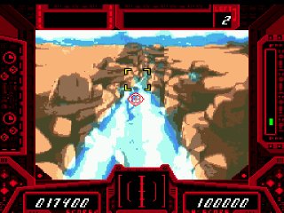
Cobra Command in action - Press the button in time or the scene will repeat (oh, no!)

In fact, the disillusionment with the Sega-CD soon made me quit playing games on consoles altogether. My dad had brought a Power Macintosh and I started playing games on it instead. Despite the popular rumour that no games were available for the Mac there were actually quite a number of quality titles being released such as Marathon, Fallout, Doom, Civilization, Sim City, Dark Forces, Duke Nukem 3D, the Warcraft series and most of the Lucas Arts titles.

Then in 1997 things changed, me and my friends discovered emulation, the running of old games on new hardware through software called emulators. All of a sudden we were playing the classics from the Mega Drive/Super Nintendo-era on our, at that time, modern computers. And so I'd thought that I would never own a console again but everything changed with the introduction of the Nintendo Wii in 2006 and the possibility to download old classics and play on the console, much the same way that you can buy music from the Apple Music Store.

It was a game changer, all of a sudden there where a storm of sequels en remakes from the 8-/16-bit era: Mega Man 9 & 10, New Mario Bros, Castlevania Rebirth, Contra and soon Sonic 4.

My stance on gaming changed as well: the Wii made me realise that not everything post Super Nintendo was crap and that I actually missed out on some great games. I even bought myself a Playstation 3 and I have not been disappointed.

It's a great time to be a retrogamer!

Links:

2010/05/23

Me vs. Windows XP: Getting rid of the annoying beep

Moving from Mac to Windows can sometimes be bewildering. Since I got my Dell laptop I have been annoyed on a daily basis by the PC speaker "beep" that the computer emits when the volume is changed. The beep is set to increadibly loud no matter the volume. This breaks quite a number of usability principles but also causes me to jump out of my chair when I'm in the middle of editing using headphones as not to disturb my colleagues, and without thinking decide to change the volume.

On Mac OS X the beep that is emitted correlates to the new volume that you set: turning down the volume emits a lower beep and turning up a higher. But not on Windows there the beep is always set to "blast your eardrums out" level (at least on the Dell that I have).

So today after doing the same mistake of changing the volume with headphones on I went searching for a solution and after reading some forum posts by self thought ninjas suggesting that I resort to registry hacking I finally found it.

Basically you need to go into the Device Manger in the Control Panel. Change the View to show all devices, click on the Non-plug and play- drivers and right click on the Beep (yes, that is the name of the device). There in the dialogue you can turn it off by disabling the device.

Surely, a master Information Architecht was used because I cannot even begin to comprehend how someone could have dreamt up such a usable solution.

Redmond I salute thee!

2010/05/19

Me vs. Windows XP: Sorting the Programmes menu

Still getting used to having to use Windows XP as my main productivity tool. It is very obvious that it is a 9 year old operating system.

When installing programs they just get appended at the end of the programmes menu. This means that after a while it gets really hard to find anything unless you have fantastic spatial memory. To use the famous bucket metaphor: my bucket finally flowed over and I decided to find a solution.

After some googling it turns out you can sort the program menu alphabetically by right-clicking on an object in the menu when expanded and select "Sort by name". There is a registry hack to enable this permanently but for now I do it every time I do something new and it works reasonably well.

2010/05/18

UX Lisbon day 3

Last day of the conference featured a different setup than the previous two. Instead of smaller workshops there was a series of short lectures for all the attendees in the main auditorium.

Dan Saffer - Designing for (and with) New Technologies
#odannyboy Slides: -

Dan held a presentation about the progress of technology and how the need for it comes later and how the designer is being tasked with bringing meaning to the technology. He used touch screens as an example of a technology that has been around for almost 30 years but is just now seeing mainstream use. Though I agree with Dan and found his talk interesting I think that this is an oversimplification since it is not only about inventing the need but also about bringing down the cost of the technology so that consumers can afford it. I still remember going with my dad to his work to look at their company's only CD-ROM equipped PC. It was so expensive that only a trained librarian was allowed to use it.

I found it interesting that apparently Jonathan Ives started out designing kitchen appliances and that some of the design language in that field was transplanted into the computer field with his designs for the iMac. But then Jonathan Ives has been accused of copying Braun to.

Donna Spencer - Design Games

Donna's presentation was about different games (techniques) for idea generation and problem solving. The games she presented included Design the Box, a game where the team gets tasked with designing the box for the new product and Divide the dollar, an exercise in prioritizing by dividing a set amount of money to the various functionalities. She also talked about metadata games for sorting out terminology such as asking all the members of a team to name something or writing down all things they can think of in a certain category.


Luke Wroblewski - First-Person User Interfaces
Luke talked about, you guessed it: first-person user interfaces. He explained how we have gone to increasing levels of abstraction in the interfaces that we use to interact with computers, beginning with with circuit boards to punched cards to CLIs to WIMP to Natural User Interfaces finally arriving at the 1st Person UI. Luke showed some applications sporting a 1st person UI such as Layar and presented a list of features he considered signifying for the new UI paradigm:
  • The possibility to navigate the space around you like with Google Maps Navigation.
  • The augmentation of the immediate surroundings like with the Layar Browser.
  • The interaction with nearby object like the various barcode scanner applications for mobile devices.

Steve Krug -The Lazy Person’s Guide to a Better World: Advantages of Doing The Least You Can Do™
#skrug Slides: -

Steve talked about the benefits of discount usability testing: testing frequently with few participants. He warned about the lure of fixing the low hanging fruit first because it leads to the more serious problems never being fixed. Like he pointed out in his most recent book he pointed out that you must "focus ruthlessly on the most serious problems".

Eric Reiss - Killer Content or Content that Kills?
#elreiss Slides: -
According to Eric there is only one reason to innovate: to solve a problem. Innovation simply for the sake of it or to satisfy one's ego is counter-productive. Inspired by his friend Lars von Trier he wrote the web dogma 06 which just like Triers dogma manifesto is a reaction against what he perceived as bloat (in Trier's case it was Hollywood over-the-top mega-budget products). Funilly enough one of the thinks Reiss talked about was that the "About us" section is a construct of internal politics and therefore should be removed, but I have found on one of the sites I tested that it was one of the most visited sections (but on the other hand that could have been a result of other bigger problems on the page).

Susan Weinschenk - Neuro Web Design: What Makes them Click?
Susan's talked about how much of good web design speaks to the unconscious part of our mind. We humans are irrational and that is not something that we can change through training or reasoning. Examples of this are all around us such as ads suggesting the possibility to mate, how we are fooled into buying because of scarcity (the lines at the iPhone release being just one example) and the need to be part of the flock (social websites).

Understanding the irrational nature of our mind is important for good design. Susan said the brain consists of three parts (very simplified): the old brain - responsible for identifying objects that we can eat, mate with and avoid, the mid brain - stories, faces and names and the new brain - responsible for conscious processing. All parts of the brain are important when designing websites.

She gave some fun examples of people saying that cookies in the jar with fewer tasting better and how our innate fear of losing makes us spend more when we are tasked with taking away features from a car with all the extras in comparison with when adding features to the same car stripped bare.

Larry Constantine - Designing for User Performance and User Success
Slides: -
Seeing Larry Constantine talk was probably my only OMG moment at the conference due to his book Software for Use being one of the first HCI books that I ever read. The only thing cooler would have been if they had brought Jeff Raskin back to life (The Humane Interface was the first HCI book I read).

As Larry Constantine himself noted he was a bit of an outlier among the presenters since he works in the automotive industry. He talked about how UCD doesn't work in his field and how they employ activity centred design. An example he gave of this distinction was in designing navigation systems in cars where a UCD approach might endanger the user by keeping her from watching the road by introducing functionality that the user wants but is distracting. Focussing on the activities that she needs to perform instead allows Larry and his team to design solutions for users on the road without compromising safety.

Judging from the comments on twitter after the conference I there was a lot of people in the audience who didn't agree.


Jared Spool - The Dawning of the Age of Experience
Jared began his talk complaining that all the good subjects had already been taken and proceeded to dance to Beyonce's Single Ladies, generating roars of laughter.

He began his talk with how the success of Apple has put user experience on the agendas in the board rooms around the world. He talked about how Apple's iPod in many ways is an inferior product in comparison with other mp3 players but the total user experience, the combination of design and business stategy, makes up for it's shortcomings.

The increased attention to UX means that there is a greater need for skilled UX designers. He used chicken-sexing as an example of how practise makes perfect and how being a good designer is something you learn but not open to introspection (which was a fun twist: normally chicken-sexing it is used to explain implicit v.s. explicit memory). Jared talked about how the ever decreasing size of design teams requires the team members to be multi-disciplinary and that you there fore need to create teams based on skills and not on what their business cards says.

Jared listed three attributes of successful teams: vision - what will the product be five years from now, feedback - test with users regularly and culture. He talked about the need for allowing people to fail, going so far as giving examples of companies throwing parties for the people responsible for failed projects.

David Gómez-Rosado - Want magazine launch
The day ended with the launch of an online magazine about UX.


2010/05/17

UX Lisbon day 2

People mingling and buying books during the coffee break

It just wouldn't be a conference without Microsoft Surface

Jared Spool (UIE) - Designing for content rich sites
Twitter: #jmspool Slides: -
Jared Spool could probably have ended up a stand-up comedian instead of a usability expert

The main theme in Jared's talk was the scent of information: how we humans track information the same way we would track prey in the forest. In Jared's own words: "Good content must suck". He went on to clarify that he meant like a vacuum cleaner. In the studies Jared conducted he compared the behaviour to a fox chasing a rabbit and where there was good scent the user would find what she was looking for. Here are my notes:
  • There is absolutely no truth to the "three clicks theory". Where there is scent people will find what they are looking for.
  • Provide good trigger words, they help carry the scent.
  • Search logs are an excellent way to pick up trigger words and that users that resort to searching first thing is usually telling you that the scent of information on your site is weak. This is a sort of learned helplessness and after enough times trying to navigate through a site not finding what they are looking for the user will reach for the search box.
  • Scrolling has limited impact on the ability to find information but a lot of the reason for the "above the fold" design approach is that users thing that the same design fluff that they see above the fold will continue below the fold.
  • Blue and underlined is a terrible markup for links (the colour that we have the least receptors for + cutting of the decender) but users have become habituated and it therefore works. Then Jared went on to make fun of Swiss astrophysicists.
  • Banner blindness is also the result of habituation to what Jared referred to as "busy crap".
  • Start designing bottom up. The home page is the least viewed of all pages.
  • Call reps are a great source of trigger words.
  • Using back, pogo-sticking and using search are tell-tale signs that the scent is to weak or as Jared made us chant in chorus: "The back button is the button of doom".
  • Users don't want to navigate globally if you spend to much time on that you are solving a non-existent problem. Because users don't search for categories (searching for books at amazon.com is less likely to happend than someone searching or a title).
  • Jared says mega-dropdowns suck because they weaken the scent.
  • Don't piss them around with irrelevant stuff in order to make the users stay on the site longer, it won't succeed.

Harry Brignull (Madgex) - What you need to know about eye-tracking
Twitter: #harrybr Slides
Harry held a short en concise workshop where he talked about common misconceptions of eye-tracking. He emphasized that eye-tracking only tells you what the user is looking at and that there is a big risk over over-interpreting the information. These are his 4 things you need to know about eye-tracking:
  • It only tells you what the user looked at not what they did or said.
  • It only tells you what the user looked at at the end of the seccade but not what they grazed over or what their peripheral vision picked up.
  • Eye-tracking is not scientific by definition even though it looks sciency, there is a risk of being carried away and over-interpret.
  • To interpret any eye-tracking data you must know the question being asked to the participant.

Justin Davis (
Madera Labs)
-
Make it obvious: Affordance as design tool
Twitter: #jwd2a Slides
I signed up for a presentation by Donna Spencer but it was instead being held by Justin Davis. I'm not quite sure why. Unfortunately this presentation was really beginner level although for people who don't know what affordances are I'm sure it was rewarding to attend. Justin talked about the history of affordances (Gibson, Norman, Gaver etc.) and then how the initial concept has a slightly different meaning than it did in the science of perception which Gibson studied.

An affordance, in Gibsons view, is our perception that something, unbeknownst to us, affords a certain action. The perception that a surface invites to a certain type of action and is relative to the actor: an infant and a grown woman won't perceive the same affordance in a flight of stairs (the baby is to small to use them).
It only included real physical objects in Gibson's original theory.

Norman transplanted the term into HCI and instead of only taking the physical capabilities of an actor into account also made the term include the actor's goals and past experience. The meaning came to shift more to "invite to action" rather than the original "affords an action". Also Gibson never meant to include things on a computer screen because he based his theory on how light bounced of surfaces (ambient optical array).

Gaver expanded on the concept and categorised affordances into false (looks like an affordance but isn't), true (looks like an affordance and is one) and hidden (doesn't look like an affordance but is one).

Then Justin went on to talk about the importance of designing button that look like real world buttons and therefore affords clicking. My question remains whether or not this is the result of habituation only or the fact that the button looks like a real world object.

Justin's three guidelines:
  • Mimic in real life properties.
  • Watch users, do they perceive a button as clickable or not?
  • Respect convention.
Peter Merholz (Adaptive Path)
-
Product Strategy and Planning Tools
Twitter: #peterme
Slides: -
Peter was really hard to capture on camera, he kept running back and forth as he was talking

Peter's workshop was the first part of the Adaptive Path UX Intensive set of workshops. It was more a set of exercises to use when focussing, defining and setting scope for your design strategy than a lecture (like the previous workshops). The session centred around of how to implement the right design strategy for your product. The most important take-away for me was exercises for deciding which features to cut and how to design a realistic road map for future releases.

After the seminar we there was a screening of the movie Objectified and we proceeded to have drinks at an Irish bar, food at a seafood restaurant and finally some more drinks at the aforementioned Irish bar.

2010/05/16

UX Lisbon day 1

It was an early morning for me since registration started at 8.00 and Portugal is one hour before the Netherlands.

To make matters worse the map that I got when checking in wasn't new enough to include the recently built Red (Vermelha) line. But after some confusion I arrived at FIL - Feira Internacional De Lisboa.

After registration I took place in one of the auditoriums for the first session

Caroline Jarrett - Label placements in forms
People who didn't sign up for other workshops asked me later if it really was possible to fill 3 hours just talking about forms and 'yes' it is entirely possible.

A lot of stuff that she spoke about were old news to me but I was interesting to hear about her research. Here is a compilation of my notes:
  • Just as with all other applications forms must be tailored to suit the audience you are designing for (scientific calculations v.s. a simple sign up).
  • Forms are susceptible to "lost in translation" mistakes but general form design holds true across cultures.
  • Don't begin a form with the hardest questions that way the user has some momentum when she encounters them and due the the effort invested is more likely to fill them in.
  • Don't put a lot of space between the label and the form field itself. It makes it much harder to fill in (it made me think about the Apple Human Interface guidelines).
  • It is debatable if questions above the form field or left aligned next to the field makes much difference for short questions. For longer questions is makes much more sense to put the question on top due to alignment issues.
  • Highlighting the background of a label and the adjoining field helps the user keep track of her status.
  • Make sure that short forms are above the fold, especially the submit button.
  • Use "any reasonably harmonious arrangement and then test it"
  • People quite often confuse hints for default values. I asked her about the wording of the hints mattered but she had not yet tested it.
  • The symbol for mandatory is less important to users and quite often stupid to add in the first place. Why are you asking for it if it isn't mandatory? In the few cases where options aren't applicable point out that they are optional instead. If you are going to use some sort of indicator don't put it to the right of the form field.
  • Having the labels inside the form fields can make sense for applications where space is limited like on a phone but mostly it just confuses people.
  • Inline forms like the sign-up form on HuffDuffer seems to confuse people as well (it reminded me of the English exams back in school where I quite often would miss seeing one of the gaps and therefore miss a point).
  • For English sentence case or not doesn't seem to matter for labels (but it would just be plain weird with title case in Swedish or Dutch).
  • The use of colour so long as it doesn't cause visual strain also doesn't seem to matter much.
  • Don't use links for action (thank you)!
  • Be aware of false ends (don't put pages without input in the middle of a multi-page form).
Kristoffer Dyrkorn (Bekk) - Designing search
Twitter: #kristofd
Kristoffer's presentation was about improving the search paradigm that we are all familiar with. He showed us prototype work on a pearl growing-like search concept which drew inspiration from Google similiar and like.com. Using a set of "pearl parameters" the object being search for would emerge from the sea of less interesting stuff.

Sami Niemelä (Nordkapp) - Designing agile interactions
Twitter: #samin
Sami held a presentation about the importance of Sprint 0 in agile projects to clarify vision, lay down base work and initial planning. My most important take-away was the necessity to have planning run 2 sprints ahead of the development sprint and the ux work 1 sprint ahead.

Bill Scott - Designing with patterns

Bill's presentation was absolutely the one that I looked forward to the most the first day. He has a lengthy career behind him beginning with game programming for the Mac back in 1985. After listening to his talk with Jared Spool on UIE brain sparks I became clear that I had to sign up for his presentation. Funnily enough he spoke more about anti-patterns than patterns. Here are my notes from the presentation:
  • A pattern is a stylized way to capture the solution to a recurring problem (then he went on to talk about Christopher Alexander which I hope any self proclaimed UX practitioner is familiar with).
  • He talked briefly about the history of design patterns in HCI and Jennifer Tidwell (excellent book but a bit dated by now).
  • He compared the need for patterns to the Joshua tree principle (the importance of being able to name things). Anti-patterns are useful for the same reason.
  • Interesting moments is a concept for making sure that every state of an interaction is described. It is basically the same as a tipped over decision table that with the state of the controls in the action space (I too used decision tables for interaction design specifications when working at Knowledge Values).
  • Bill explained his six design principles:
  • 1. Make it direct - in the words of Alan Cooper "where there is input let there be output": don't introduce needless modes in your user interface. Bill used Flickr as an example of an interface that doesn't require the user to go into a separate editing mode to change properties of an image (I'm sure VIM users beg to differ). Pitfalls are the artificial construct, tiny target and mouse trap anti-patterns (list of anti-patterns).
  • 2. Keep it light weight - Make the content become interactive without resorting to needless and bloated animations and transitions. He talked about the hover and cover anti-pattern where an element would hide another element on hover and the double duty anti-pattern where a control would match to more than one action.
  • 3. Stay on the page - Don't break the flow with forcing the user to go through a bunch of pages in trying to accomplish her task. A result of this is users pogo-sticking back and forth (as Jared Spool would later point out, pogo-sticking will increase the risk of a user dropping out). Bill also talked about breaking the flow with what Alan Cooper calls "idiot boxes" (dialogues).
  • 4. Provide an invitation - Recognition rather than recall: give the user good memory cues that there is extra content available through e.g. dog ears or invitations on hover.
  • 5. Use transitions - Transitions make the UI sizzle more but they can also be a major annoyance. Bill talked about the "cheesiness rule": Take whatever animation you made and then cut it's expose time in half otherwise the interface will quickly look cheesy.
  • 6. React immediately - Be as immediate as possible, react immediately on the users request and provide an indication of the request being processed if it's not possible.
  • I asked about Hoekman Jr's statement about design patterns not being enough and Bill said that it was basically the same thing but on a higher level. He seemed to be hesitant to say anything negative about Hoekman's statement though.
The day ended with drinks at the brewery where beer was served in giant towers.

2010/05/12

Lisbon sightseeing in preparation for UXLX.

Tomorrow it begins. Due to the massive ash induced delays I wasn't able to attend the pre-conference get-together but I did manage to see a bit of Lisbon. Unfortunately the pope was there to and it was jam-packed with people and they blasted pope music through loudspeakers throughout the whole city centre (Three things he has in common with a recently deceased pop star).

I had some traditional Portuguese cuisine at a touristy restaurant and I whole-heartedly agree with the Jews: seafood and meat do not mix well. Tomorrow I'll try something else on the menu.

Going down town passing by Praça dos Restauradores

The view from the hotel room - Aguas Livres

Oh, and on an unrelated note: HTC started twittering that they are rolling out 2.1 updates for certain phones maybe soon they will release the update for Hero!

2010/05/11

TAP Portugal - pay good money for low budget service

This is my first flight with TAP and if you can judge the people based on their airline they are probably a dwarflike people with a deep love of tea-like coffee.

Combined with that the link to online check-in didn't work, understaffing at the checkin desk and a one and a half hour delay without any information; you got a really horrible experience. The woman talking down to me when asking about the delay is just an added bonus.

If you are going to Lisbon from Amsterdam don't choose TAP.

Just look at all that crazy leg room!

Waiting at Schiphol (note to self: don't fly TAP)

I arrived at Schiphol in good time but then stood in line for almost an hour waiting for check-in. I know it shouldn't surprise me but it is incredibly frustrating to wait for people trying to check in seven bags, going economy with multiple pieces of hand baggage or traveling with fluids. Have the not stepped on a plane in the last four years? None of which was helped by desks closing and the only person left was a poor girl who acted as if it was her first day.

Side note: TAP didn't even post anything about the ash cloud on their web page until yesterday only to have it removed later the same day. Talk about poor customer experience!

But at least I made it to the gate on time. Ux Lx here I come!

2010/05/09

Laziness is the mother of all inventions (VNC Windows to Mac OS X)

Today has been an eventful day in front of the computer. I need to finish up a lot of stuff before going UX-LX since I'll be gone for a week (if the Icelanders permit).

However at home I use my girlfriends iMac as a stereo. Back when I had a MacBook as a work laptop I would just have a Apple Remote Desktop session running and change the music remotely. Now I have a standard issue Dell Latitude and Apple Remote Desktop is a thing of the past.

I started out using TightVNC but it was not a pleasant experience since the connection kept dropping and there was no support for scaling which is a necessity when you are trying to view the contents of a 24-inch monitor on a 15-incher. So I moved to RealVNC and now I had scaling but the connection kept dropping just the same. After some googling I found out that a lot of people have problems with the built in VNC server that comes with Apple Remote Desktop.

So my new solution is to use Putty to restart the damn thing whenever it goes down with:

sudo /System/Library/CoreServices/RemoteManagement/ARDAgent.app/Contents/Resources/kickstart -activate -agent -restart -console

It's a workaround but at least it works and I don't have to move.

2010/05/08

Me vs. Windows XP: Clearing out the temp files

It's very nice to be working at a big mature organisation however there are also drawbacks. One such drawback is the rigorous security of which one part is having to work against a server all the time and the other is having to use Windows XP. When I work from home all my files need to be synced to the server. Since this includes all files it also includes all the temp files (temp files are temporary backup files that applications write and then usually forget to clean up afterwards).

To minimize the wait I have written a small script that removes all the temp files in the Windows\Temp directory as well as my own Temp catalogue.

So if you are in a similar position or just don't like having your computer cluttered with thousands of small abandoned files, fire up Notepad and enter:

del /f /s /q C:\windows\temp\
del /f /s /q "C:\Documents and Settings\%USERNAME%\Local Settings\Temp\"

Save the file with the ending .bat (you need to select all files in the Save As dialogue) and drop it into your Start up items directory. You'll find it by accessing the start menu and right click explore on it.

Now every time you log in all those files will be a thing of the past. But don't try this if you don't know what you are doing.

User Experience Specialist at Reed Business

I have been very very very busy over the last few months. I got a new job at Reed Business and subsequently quit my job at Knowledge Values. My new life as User Experience Specialist at Reed Business started in January and I have been almost living in the office since then.

The new role at Reed has brought with it a lot of changes apart from being able to solely focus on usability I now work 100 % in Dutch. At my old company business was done in English and conversations with colleagues were done in Dutch. So "going completely native" was quite a challenge in the beginning, albeit a very fun one.

The idea is to resume blogging now that I am more comfortable in my new role.